The Process of Process: The New Kid
I just completed a very fun job for Random House. They are great people to work with. The book was written by Newbery Honor Winner Mavis Jukes and is titled The New Kid.
This post is a written and visual record of the steps involved to develop illustrations for the front and back covers of a book.
What appears on the face of it to be a simple drawing can involve many iterations and lots of back and forth communication between the illustrator, art director, editor and the author.
The majority of the narrative in this post is by the most wonderful art director, Sarah.
Enjoy!
Sarah wrote to describe the project, “Hi Karl, I work as an art director here at Random House Children’s Books. I would love to hire you to illustrate the cover of a middle grade novel called The New Kid. I have the design/concept worked out and approved by the editor and author — I’ve attached a jpeg of the concept.

I would basically need a few small spots of a kid. One on the front cover in the “I” of Kid. And another spot for the back cover (possibly the back of him) and maybe another for the front flap.
The New Kid story is very sweet—it’s about a 3rd grade boy named Carson who moves to Northern California with his Dad. As soon as they arrive in their new home, Carson has to start going to a new school. He is at first nervous, friendless and alone. But, he is determined to make friends! It’s told in small vignettes of things that happen in the classroom.
Here is a description of Carson’s new school uniform: A brand new white shirt and tan pants, a brand new Valley Oak zip up hoodie with a silhouette of an acorn on the front, a brand new Valley Oak wind breaker with a silhouette of an acorn on the sleeve, and a brand new Valley Oak backpack, with a silhouette of an acorn on the back. He could be wearing all these things or a combination?”
Here are the initial sketches I sent to Sarah generated on my WACOM tablet:

Sarah wrote back, “Karl, these are great! I’m liking numbers 1, 2, 6, and 10. He should look eager and nervous but, not too sad. I think I like 6 the best. But, the style of 1 and 2 are good too! It’s looks like you had fun doing these! Hope that helps. Thanks for sending the rough pre-sketches!”
I did some new sketches and sent the following trying different line quality and expression.

Sarah responded with some comments. “The editor, author, and I all like sketch C the best! The author had a few comments about Carson’s ethnicity.”
I find doing humorous illustrations of animals simpler because ethnicity, race and gender don’t enter into the equation. In this situation, the art director decided to go for an ethnically neutral kid. He could be whatever the viewer wanted him to be. That poses a bit of a challenge for an illustrator.
I wrote Sarah, “I have done line art for a number of subtle, ethnic variations of version C. Very subtle, but once we get that nailed, we need to decide if you want me to do the bold, vector color, like on the Sammy Keys covers, or a more subtle, Dr. Martins watercolor wash. If there is a sample in my portfolio you are drawn to, let me know.”
I generated multiples of the kid with the face blank, and then drew variations of facial features to give the art director a number of choices – sixteen variations in all.
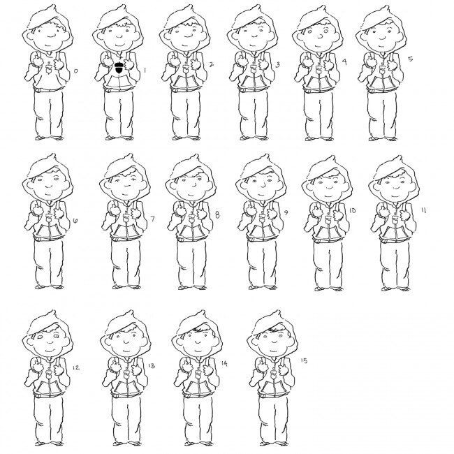
She wrote back: We picked #9 and #10! And the graphic acorn on #1. I think a color version would be good to show the author!
So I did color versions, some with a loose water color wash, some bold color generated in Photoshop.


After reviewing the color versions, Sarah made some choices. “Hi Karl, I got your color versions here and they look great! I’m liking #4 the best. I like the bright blue and I think that his skin tone coloring is right here too.
The editor has given us the ok to move onto final art! She and I agreed on the coloring and style of #4 (blue hoodie).”

This art was generated on the WACOM tablet and colored, on a second layer in Photoshop.
I sent it off, and Sarah wrote back, “So, I think your little color Carson here looks great as is! I just mocked up the final design for the editor and she likes it! So, now we’re just waiting to here what Mavis thinks. I’ve attached a pdf of what it’s looking like! Hope you like it too! I’ll keep you posted!”

The author Mavis Jukes gave the cover her blessing. Sarah wrote, ” Hi Karl!–Mavis loves it! YAY! I’ve attached a jpeg of the FINAL designed cover.”